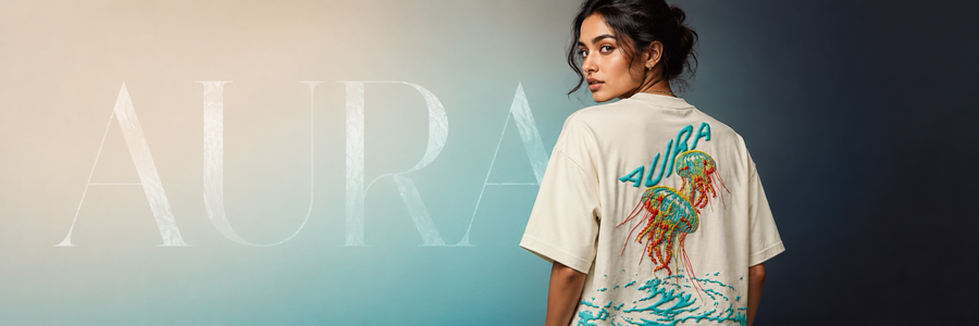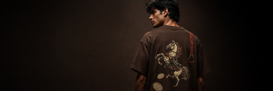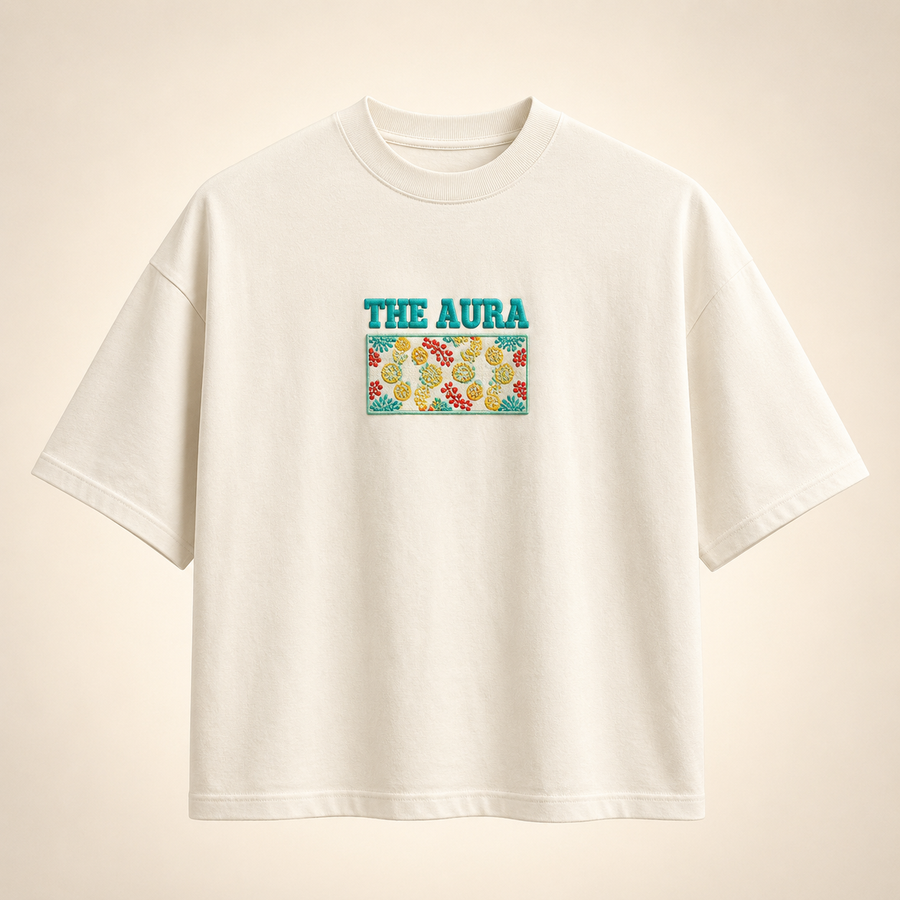
A finished T-shirt looks simple. The process behind it is not. Every THE AURA piece begins with an idea, then moves through artwork, colour, placement, fit and print decisions before it becomes part of a drop.
For Drop 001 — Journey, the purpose was clear: create oversized graphic T-shirts that represent different stages of becoming, not graphics added without meaning.
1. Begin with a feeling, not a trend
The starting point is always the message. What should the piece represent? What should someone feel when they wear it? A strong design needs a reason to exist before it needs a colour or illustration.
That thinking shaped the six chapters of the first drop: Ascension, Bloomscript, Odds, Untamed, Abyss and Legacy. Each chapter carries a different idea, from rising above limits to creating something that lasts.
2. Translate the idea into visual language
Once the meaning is defined, it becomes a visual system. Typography, symbols, illustration style and composition are explored together. The design needs to communicate from a distance, but it also needs details that reward a closer look.
We consider how the artwork feels on the body rather than treating the T-shirt like a flat poster. The scale, direction and negative space must work when the person is standing, walking or layering the piece.
3. Decide where the artwork belongs
Placement changes the character of a graphic T-shirt. A smaller front detail can create curiosity, while a larger back design can turn the garment into a statement as the wearer moves.
The front and back are designed as one experience. They should feel connected without repeating the same information. This is why the final placement is evaluated as part of the full silhouette.
4. Build the colour story
The garment colour must support the artwork and the meaning of the design. Contrast matters, but mood matters too. Deep brown can feel grounded and lasting. Off-white can create clarity and space. Red, blue, black and maroon each shift the energy of a graphic before a single word is read.
Colour choices are also tested against real styling. A strong product should work beyond a campaign image and fit naturally into an everyday wardrobe.
5. Use texture with purpose
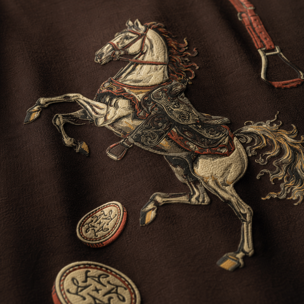
Raised puff print gives selected designs a tactile quality that standard flat printing cannot create. The texture catches light, adds depth and makes important elements of the artwork physically stand forward.
The effect should support the concept rather than overpower it. Print height, line thickness and spacing all influence whether the final result feels refined and readable.
6. Protect the oversized silhouette
Artwork is only one part of the product. The fit must carry the same confidence. A balanced oversized T-shirt needs a controlled dropped shoulder, comfortable body width, considered sleeve length and enough structure to hold its shape.
Print placement is reviewed against those proportions so the graphic stays correctly positioned across sizes.
7. Review the piece as a complete story
Before a design belongs in the collection, every element needs to agree: message, artwork, colour, print and fit. The final question is not only whether the T-shirt looks good. It is whether the piece still communicates the original idea.
Design becomes meaningful when every decision points back to the same story.
Explore the complete journey
Visit the Product Journey to discover the description and meaning behind every piece, or shop the full Drop 001 — Journey collection.